
Colour Theory for Bikes


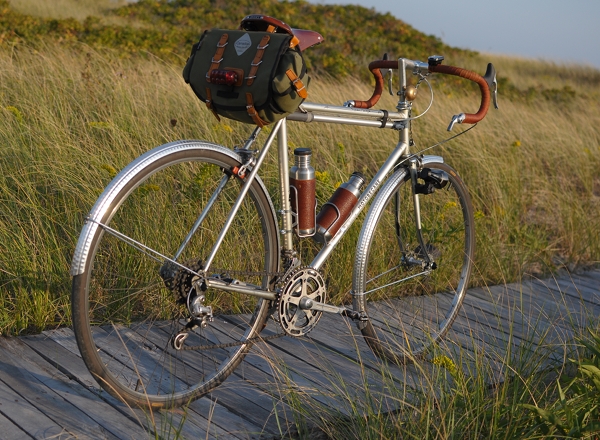
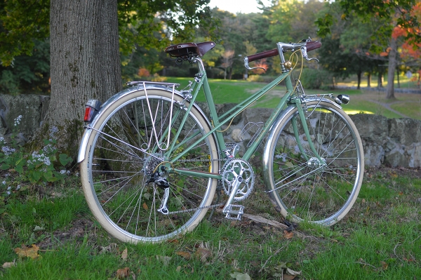
My go-to standard for handlebars and saddles is the brown family. The reason I like to use brown as opposed to black, is that brown enhances the colour of the bicycle frame, whereas black tends to "deaden" it. Being neutral, brown will not compete with the frame colour, just as black will not. But it will make the colour more vibrant, more emphatic - whereas black will leave it flat.

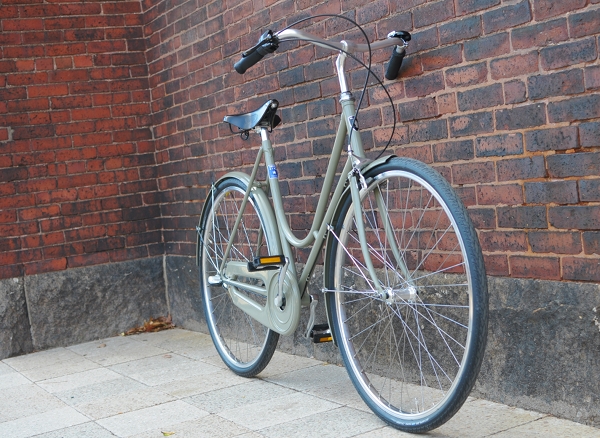
And when it comes to racing bikes, an aggressive or sporty look is usually more fitting than an "earthy" look. This can be achieved either with black, white, or brightly-coloured saddle and tape combinations (ideally in a contrasting colour to the frame). Bright and high-contrast colour schemes are exciting and suggest high energy, fast movement. If that is what you want your bike to communicate - go with it. And if not, you can tone it down with browns and neutrals, as I have done to this bike.
Tires
It goes without saying that performance and not colour should be the first consideration when it comes to tires. But assuming that you can get equally well-performing tires in a variety of colours, it can be nice to play around with that element as well. While I do not hide my crazed preference for cream tires, I do not suggest that they are "the best" option.Cream tires can look elegant if you are going for a delicate look and have taken pains not to include any black on your bike. Here they make the bicycle look a lot more "serene" than had I used other tire choices.
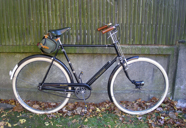
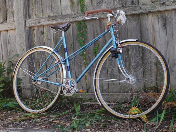
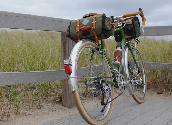
I am very conservative when it comes to bicycle "luggage," so perhaps I am not the best person to ask about this one. Mainly, I don't like it when bicycle bags are too distinct in relation to the bicycle itself - whereas the trend now (especially for accessories targeted at women) seems to be brightly coloured luggage with prominent graphics. It's not that I am "against" flowers, polka-dots, curly-cues, and the like. It's more that I want my bicycle to be the main focal point and not the bag. So I prefer to get subtle, classic accessories in neutral colours. As with saddles and handlebars, I think that the brown/olive family works well for a nature-exploring sort of look, whereas black works well for a more aggressive or racy look.
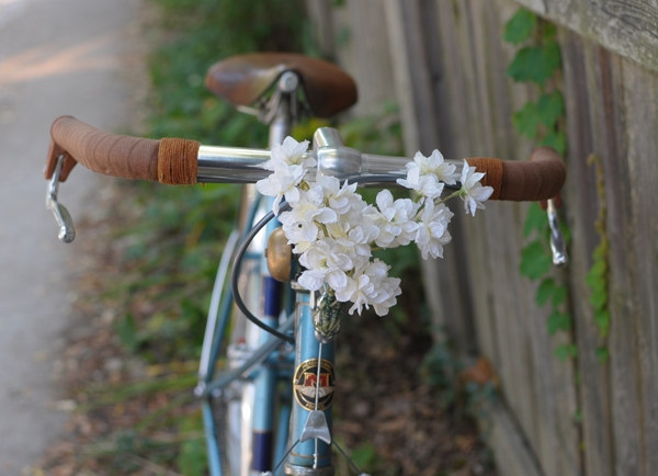
Unless intentionally using decorations to distract from the rest of the bike, the colour of the decorations should not stand out too much from the other colours on the bicycle. Otherwise, the eye will get drawn to the decoration itself, with the rest of the bike an afterthought.
If you are getting a bicycle frame re-painted, or are trying to choose a colour for a custom bike, the colour selection is of course a matter of personal preference. But based on my own experience (and conversations with others), keep a few things in mind:
1. Speaking very generally, super-bright colours work better on sporty bikes, whereas subdued colours work better on touring and transportation bikes.
2. True white is very harsh and almost never looks good. Even if a bicycle you like appears white to you, the actual colour is almost definitely a pale cream, a very light gray, or an off-white. Think twice before asking for a true white paintjob.
3. If you are getting the paintjob (especially powdercoat) done at a "budget" type of establishment, beware of asking for metallic colours. They are easier to mess up, and flaws in them are more visible than with regular colours. Flaws in lighter colours are also more visible than flaws in darker colours.
4. Prepare yourself for the fact that the colour never, ever looks the same on the bike as it does on the tiny colour chip, let alone on the online colour sample. I have seen some pretty amazing discrepancies, where after the person spends a month wringing their hands about the "perfect" shade, the colour on the bike does not even look like the same colour family as the chip they chose. One thing you can do, is give the painter a sample of the colour you want and ask them to find the closest match. They have experience with the way the colours actually looks on a bike. Alternatively, you can find out the colour code of a bike you like, and ask for that exact one.

This is an interesting topic as I'm just reading a Van Gogh biography (oh, don't shiver, it is just a "Time-Life" book) that deals nicely with what he was messing around with concerning color.
ReplyDeleteNo point to be made, my favorite color is dark.
I find it hard to verbalize why something "looks good." So I am impressed with this post. I can definitely see the artist's eye when it comes to your bicycles.
ReplyDeleteThanks Kara : )
ReplyDeleteDave - I think that Van Gogh, like Munch, has been somewhat "ruined" by the way he has become fodder for parody in pop culture. There is so much more to Van Gogh than "Starry Night" and "the stuff about the ear," and it is upsetting that his work has been reduced to this. But I digress...
I am always impressed with your take on colors and bicycle aesthetics. I appreciate your help and advice re my RoyalH. Great topic. Keep 'em coming!
ReplyDeleteVelouria- How is this a digression? About Vincent, yes, so much so that what you wrote is almost a quote from the opening paragraph of this book, "let's get it out of the way now, it was only his earlobe". Vincent has been a life-long interest, at least since my art-school days. I'm just now understanding some elements of color & design that always before I trusted to my gut, but now carefully consider. But then, you are mostly an Artist, and I'm mostly a craftsman.
ReplyDeleteI am a big fan of Van Gogh myself. Being mostly an amateur astronomer I like Starry Night, although I do know there is more to Vincent than Starry Night or the Potato Eaters! He has been over analyzed yes, but that does not detract from the intensity of his work.
ReplyDeleteThis post is very helpful. The first impression a bike almost always makes for me is the color. If I like the bike and the frame, but the color is not so attractive, then the next thing that pops into my mind is well, how do I live with this color and what can I do to subdue, or enhance the palette of the frame.
ReplyDeleteSM
Color is a fascinating topic with a clearly historical significance. Perhaps even more interesting are the psychological effects color has upon our consumer society. It's somewhat ironic that the color theory relating to the various harmonies that will provoke a "buyer response" becomes such big annual business for fashion and industrial designers when you consider that some of the most enduring of classical color schemes seem to periodically recur. Magenta and lime green may have experienced a brief upsurge of popularity in the Miami Vice 1980's, but warm earth tones coupled with forest green never seems to fall out of favor for very long. Philip Ball's book, Bright Earth: Art and the Invention of Color is a terrific exploration of the impact color has had upon culture. Even better is that you don't HAVE to be an art historian to enjoy the book - you might just be someone who is interested in the reaction we have to color on human ephemera... say, on something like a bicycle.
ReplyDeleteYou think about this stuff a lot more than I do.
ReplyDeleteHi Velouria,
ReplyDeleteI'm also a Boston bike blogger and I just wanted to let you know I really appreciate your passion for vintage bikes. My bike blog is typically only about bike touring, but after reading your blog I purchased a vintage Raleigh off Craigslist (gorgeous blue Robinhood) and am learning to fix it up. Your blog has been most helpful! Anyway, to show my gratitude, I highlighted your blog in my blog. Thanks so much for being so inspiring! http://againstthegrind.com/2010/11/22/website-profile-lovely-bicycle/
Cheers!
Jessica
Thank you for sharing and writing about this subject. You are way beyond where most of us are on appearance and contrast. I've recently been contemplating what to do with my black frame bike to add some flair. Now I have some direction.
ReplyDeleteVeloria, are you Canadian or British? The American spelling is "color".
ReplyDeleteJimP - I don't mean to say that I think Starry Night is "bad," just that there are so many pop cultural variations and parodies of that image, that much of the original aesthetic and mood has been sucked out of it - which is sad. When I was growing up, my favourite Van Gogh painting was the Irisis (the one with them in a field, not in a vase).
ReplyDeleteJoseph - I am used to using the British spelling and find it easier not to switch back and forth - especially since readers here are international.
ReplyDeleteNice post. I enjoy my brown saddle and handlebars quite a lot, and I absolutely love my cream tires. However, I think I could be happy with almost any frame color and matching accessories (and clothes!).
ReplyDeleteActually I also really like the bikes that are entirely in one color. I've seem some in yellow, brown and white. They certainly stick out.
I always liked how the old Schwinn Varisty was offered with handlbar tape to match the frame color. There was something sporty, in a mass produced, plasticy manner about that.
ReplyDeleteI have always prefered rich darker colors. And love the imposing all black look of my Raleigh DL1.
However, if the frame is a dark color other than black(even then depending on the bike), I would definitely go with a brown saddle to give it a rich earthy and more friendly classic look.
A good British racing green with brown leather and minimal chrome would be an ideal for me.
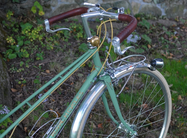
@Velouria: The brass you have with the bells is a nice of touch warmth amid the chrome. It balances well with the brown leather.
Keep in mind that while lighter colors can show flaws in the paint itself moreso than darker ones, the darker colors will enhance imperfections on the surface being painted more than will a lighter color. When repainting, good prep work is crucial for a good result.
I'm very much enjoying seeing "colour" instead of "color." Although it does look a bit odd when used in the same post as "tires" instead of "tyres," I like tyre because it only has a single meaning. "The bike tires," could be a reference to the bike's tyres or it could be intended as pathetic fallacy.
ReplyDeleteI prefer the American approach to numbering floors in a building though, so it isn't just blind national pride.
Mr Colostomy - I've been wondering why I don't write "tyres" while I write things like "realise" and sometimes even "connexion". And I think it's because I've only written "tires" in an American context and so I never got used to the British spelling. I use British English in documents I put together for work, but somehow "tyres" never comes up. And I suppose I could edit all the posts here to make it consistent, but then I also think "tyres" are less searchable then "tires". So maybe I'll just keep it weird like this.
ReplyDeletei noticed you also haven't used the word "spanner" in your posts, but have used the word "wrench". i guess it depends on the linguistic context in which you are surrounded when you start to use a particular word (as in tire versus tyre).
ReplyDeleteas for colors, i've always been attracted to pastels and other muted tones, and this shows in my recent bike color choices. however, there's something about a gloss black bike that can be stunning if done right, especially with restrained use of a contrasting color.
my current bike project is going to be done in some form of antique white/almond... mmm... can't wait.
I will confess to be more in the camp of color obsessed than out of it, especially when it comes to ordering a frame. Indeed, I agreed to an extremely extended wait time for my Hillborne frame because it was no longer available in my size in green and for me, orange was not an option.
ReplyDeleteLikewise, I annoyed everyone I know for several weeks trying to choose the color for my roadster. Thankfully, I already knew I was going to have brooks brown grips and whitewall delta cruisers (more of a cream and black than a white and black, perhaps worth noting on your list of tire color choices?). This excluded some frame colors I would otherwise have considered.
On the other hand, I'm much more go with the flow with my vintage bikes. When I bought my silver and light blue Trek, I knew the tires needed to replaced, and that I wanted white tires, but I had initially planned to change the black saddle and black foam bar covering to natural cork bar tape and a honey saddle. I ended up finding white cork tape at my LBS and a good price on a black B17 on ebay, and I actually like it better than I think I would like the warm toned colors I planned originally. I added an all black acorn handlebar bag to the mix, and I think it looks divine :)
Unfortunately, the downside of "curating" a vintage bike well, is that it starts to look expensive again...
@velouria, It does seem like changing "tires" for "tyres" would probably be more effort than it is worth, although I've noticed that when I use "tyres" as part of a Google search it also brings up results containing "tires."
ReplyDeleteKeeping a mixture of US/UK spellings may make people more aware of the differences in spellings which exist in different places and is probably a good thing overall.
somervillain - I know, I'm all over the place linguistically! Appalling. I need to stop moving around, and lose all my accents while I am at it. If another person asks me where I am from, I might just snap.
ReplyDeleteAntique almond and custard are some of my favourite colours for vintage bikes. I saw a French one when I was last in Austria in just the ride, with a matching Porteur chaincase and it was just "to die for".
Carine - As far as expensive goes, there is a seedy underworld of black market trades and cheap sales with other bicycle enthusiasts : )) Once I discovered it, my perspective on pricing changed entirely.
You wrote: "It's not that I am "against" flowers, polka-dots, curly-cues, and the like."
ReplyDeleteI'd like you to prove that, with your earth tones, leather and twine, Cambridge sensibilities on such prominent display on the blog!
"somervillain - I know, I'm all over the place linguistically! Appalling. I need to stop moving around, and lose all my accents while I am at it. If another person asks me where I am from, I might just snap."
ReplyDeleteA friend of mine who was born and raised in London, lived in Connecticut and Florida, then back to Oxford for university is often queried on his hodge-podge accent. He tells them he's "Mid-Atlantic".
It occurs to me that one can also vary effects by working with reflective values. A satin-finish combined with gloss accents, or vice-versa, can have some really interesting effects on color depth and overtones, as well as reflective highlights. That would be another advantage of a light shellacking on a twined surface, for example; it would be matte compared to the bright polished surface of a handlebar, or just a little duller than an anodized one.
This is something I try to do in my particular field.
Dweendaddy - Fair enough : )) Would it be in bad taste to post pictures of my bedspread and headboard on line? The latter is a filigreed motif executed in metal, painted white. The former is cherry blossoms in various shades of turquoise, green, and slate gray. I love that stuff - especially "Jugendstil" style florals (like on my avatar on the right side panel). Just not as luggage on a bike, as it overwhelms the bike. What I would like very much though, is a set of dressguards made of wire twisted into a filigreed design. Black wire on a black bike. Ahhh...
ReplyDeleteOh and pertaining to bikes specifically - I absolutely *love* the Basil Mirte pannier in Delft blue. Love it so much! But I tried it on my Dutch bike and the pannier completely "takes over" visually. To me it just doesn't look right - unless again, a bike is so ugly that one wants to disguise it with the accessories.
ReplyDeleteVelouria - I just meant that when you put some new accessories on an old vintage bike, sometimes it can start looking like a "steal me" bike! NOT that I would not like to be invited to said black market... Especially now that I've become a bit addicted to fiddling with my bikes! :)
ReplyDeleteBoth my spelling and terminology can be a bit "over the map." It's often connected to what I've been reading lately. If I've been reading something in the English/Dutch creole that existed for a time in NY my spelling can get a bit "interesting."
ReplyDeleteInteresting thing though, although I often leave the "u" in and use "s" instead of "z," I can't recall ever having used the spelling "tyre" other than deliberately. It's certainly not through lack of familiarity; in my youth I read more English literature than American, but that one didn't "take."
Show me the way to that seedy underworld. I'm going to need it if the Huffeigh is ever going to ride again.
Protip: Beware of bikes covered with 1/4" of silt (yes, I said "silt"). You never know what's going to be under there.
As far as saddle color complementing frame colors, I agree that brown helps accentuate the frame color - most of the time. I'm building up a Raleigh Supercourse that is brown in color. I've found that a black Brooks actually looks best to me, as the brown or honey brown compete with the lovely brown frame color.
ReplyDeleteExcellent recommendations about colours. I have been scratching my head about a colour combination for repainting my Raleigh touring bike and this post gave me some excellent pointers in the right direction.
ReplyDeleteAny thoughts about a light blue frame with subtle orange accents paying homage to the 1970's Gulf livery Porsche?
Thanks :)
What is the color of the bike in the first and last photo? Please let me know. Thanks. nspeck99@yahoo.com
ReplyDeleteDid you know this is the second search result if you google "bicycle color schemes"? It is a fantastic article. I have a sky-blue biria citibike (http://www.biria.com/sites/default/files/styles/910x0/public/citilady-babyblue.jpg) which comes with black cable housings which i don't think looks so great on a light blue frame, so i just ordered some cable housing kits very much like what's pictured on that green bike. Are they the jag-wire ripcord housings? (http://www.amazon.com/Jagwire-Ripcord-Derailleur-Gold-Medal/dp/B004JKJW2O/ref=sr_1_29?s=cycling&ie=UTF8&qid=1332706128&sr=1-29)
ReplyDeleteI got the Hyper kit, it seems closer to a tan than a gold, and I'm going for something kinda subdued. The glittery-type one on your green bike goes amazingly well given its metallic painted accents.
Anyway, great post - you have a wonderfully tasteful eye, and your cream tires directory is helpful, too!
-M
I really love the color of the first picture and I think the same bike is in the last picture. I was curious what color that was and what kind of paint job? Is it a powder coat? If it is how did you do the gold trim on the details? It looks completely amazing. Please let me know at danieltran823@yahoo.com. It would be great to here from you and learn. Thank you!
ReplyDeleteRead Christopher Moore's Sacre Bleu ;) It's cheeky fun.....I thought this article was a good mix of colour aspects and personal choice. :) One of the best parts about cycling is picking out your next ride, the colour/style/mix of components. I would never care if someone didn't like my bike..good, guess you won't be asking to ride it....lol! Thanks for the insight! :)
ReplyDelete